Interface
This page provides a complete walkthrough of the Lottie Creator interface. It explains each part of the interface so you can navigate the editor efficiently, understand core UI elements, and begin creating animations with confidence.
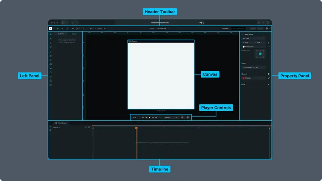
Lottie Creator's interface is organized into six core areas:
Each area is covered in detail below.
Header Toolbar · Left Panel · Canvas · Right Panel · Timeline · Player Controls
1. Header Toolbar
The Header Toolbar contains the main drawing and editing tools, file controls, view options, mode switching and user account management.
Tools (Left Section)
These appear on the far left of the top toolbar:
- •Move Tool (V)
- •Move Anchor Tool (Y)
- •Shape Tool: Rectangle (Option/Alt + R), Ellipse (Option/Alt + O), Polygon, Star
- •Pen Tool (G)
- •Text Tool
- •Hand Tool (H)
- •Zoom Out (Cmd/Ctrl + Minus) / Zoom In (Cmd/Ctrl + Plus)
- •
Zoom Level Dropdown: Zoom to fit (Cmd/Ctrl + 0), 50 percent, 100 percent, 150 percent (Shift + 1), 200 percent
These tools control selection, drawing, editing and navigation on the canvas.
File and Project Controls (Center Top)
The file controls are displayed in the header as a breadcrumb:
Drafts / Filename ▼
Example: Drafts / Untitled file ▼
This area controls how you interact with the current file and its workspace context.
Clicking “Drafts”
Opens the Drafts folder in LottieFiles.
This takes you to the LottieFiles web dashboard view of your drafts, where you can:
- •Open other draft animations
- •Create new files
- •Delete or rename drafts
- •Move or organize files
- •Browse your personal workspace content
This navigation temporarily leaves Creator and returns you to LottieFiles.
Clicking the Filename Dropdown
Opens file specific options:
- •Save
- •Rename
- •Make a Copy
- •Move To
These actions apply only to the current animation file.
Workspace Mode Switch
Two modes are available:
- •Animate: The main animation timeline and drawing workflow
- •State Machines: The interactivity and logic graph mode
Modes can be toggled from the header.
Share and Export Buttons
Located beside the mode switch:
- •
Share: Opens the Share Panel, where you can generate Remix links or publish the animation to the LottieFiles community.
- •
Export: Export as Lottie JSON, dotLottie, MP4, GIF, WebM and more to LottieFiles workspace or publish to community.
Profile and Workspace Menu (Right Edge)
Clicking your profile photo reveals:
- •User identity (name and email)
- •Workspace list
- •Current workspace indicator
- •Workspace roles
- •Log Out button
2. Left Sidebar
The Left Sidebar provides navigation, project structure, onboarding shortcuts and plugin access.
It includes four main sections:
Outliner
The Outliner shows the hierarchical structure of the current scene:
- •Scenes
- •Layers
- •Groups
- •Nested layers
- •Visibility and lock icons
- •Drag to reorder handles
This is your main navigation panel for managing layers.
Get Started Panel
Contains onboarding and file resources:
- •Recent Files
- •Assets
- •Upload Lottie or SVG
- •What’s New (release notes)
- •Plugins
- •Tutorials
- •Help Center
- •“Show this on launch” toggle
This panel helps new users jump into projects quickly.
Upload Assets
The Upload Assets section in the left sidebar provides two options for bringing content into Lottie Creator.
1. Upload Assets
Import files directly from your device. Supported formats include:
- •Lottie JSON
- •dotLottie (.lottie)
- •SVG files
- •PNG and JPG images
You can also drag and drop files onto the canvas to upload them instantly.
2. Open Animation from URL
Paste a Lottie JSON or dotLottie URL to load an animation directly from the web.
This is useful for:
- •Quickly pulling animations from a CDN
- •Importing files hosted on LottieFiles
- •Testing remote animation assets without downloading
Plugins
Lists all installed or available plugins:
- •Community Animations
- •Motion Presets
- •Motion Copilot (AI assisted motion)
- •Spring Curve
- •SVGL Logos
- •Physics Simulator
3. Canvas (Main Editing Area)
The Canvas is the central workspace where you design, position and preview your animation. It displays a scene within the Art Board, shows visual guides and updates interactively as you adjust properties.
Canvas Overview
- •Displays a scene on the Art Board (default 512 × 512, customizable)
- •Shows a dotted background grid
- •Supports rulers and alignment guides
- •Offers snapping to grid, guides, artboard edges and other layers
- •Provides transform handles when objects are selected
Canvas Behavior Based on Selection
When a scene is selected
The Right Panel shows Scene Properties, letting you adjust:
- •Canvas size (preset or custom)
- •Transparent background
- •Origin point
- •Duration and FPS
- •Grid and guide settings
When an object or layer is selected
The Right Panel switches to Layer Properties, allowing you to modify:
- •Transform
- •Appearance
- •Effects
- •Layer settings
- •Matte options
Canvas Controls (Top Toolbar)
Controls affecting how you view or navigate the canvas are located in the header:
- •Zoom Out / Zoom In
- •Zoom Level Dropdown (Fit, 100 percent and others)
- •Hand Tool for manual panning
Canvas Navigation
- •Pan: Space + drag, or Hand Tool
- •Zoom: Scroll wheel
- •Fit to View: Cmd/Ctrl + 0
- •Actual Size: Shift + 1
4. Right Panel (Properties)
The Right Properties Panel is fully context aware.
Its contents change depending on what is currently selected, either a scene or an individual layer (shape, imported asset, image and others).
Scene Properties (When a scene is selected)
These controls update the overall document and canvas environment:
- •Canvas Size (preset options or custom width and height)
- •Transparent Background toggle
- •Origin Point selector grid
- •Time Settings (duration and FPS)
- •Guides (color and visibility)
- •Grid (add, remove or adjust grid settings)
These settings affect the entire animation, not individual layers.
Layer Properties (When a Layer Is Selected)
When you select a layer in the Outliner, Canvas or Timeline, the panel switches to Layer Properties. These settings apply only to the selected object or asset.
Alignment Tools
Available for any selectable layer:
- •Align left
- •Align horizontal centers
- •Align right
- •Align top
- •Align vertical centers
- •Align bottom
- •Distribute horizontal spacing
- •Distribute vertical spacing
These controls align the layer relative to the canvas or to multiple selected layers.
Asset Name
The top of the panel displays:
- •The layer name
- •A small icon representing its type (shape, image, asset and similar)
You can rename the selected layer directly from here.
Transform
Layer level transformation properties:
- •Position (X, Y)
- •Scale (X, Y)
- •Skew
- •Skew Axis
- •Rotation
- •Anchor Point controls
- •Opacity
Appearance
Visual styling for the selected layer:
- •Fill (solid, linear gradient, radial gradient)
- •Stroke (width, color, dash patterns, caps and joins)
- •Gradient Editing Controls (on canvas handles plus panel options)
- •Color Picker
- •Document Color Palette
Effects
Layer level visual behavior:
- •Blend Modes
- •Masks
- •Mattes (alpha, luma and inverted options)
- •Bounding Box Behavior (fit to object)
These settings control compositing and how layers interact visually.
Layer Controls
Additional controls such as:
- •Layer opacity
- •Visibility toggle
- •Lock toggle
- •Layer type options (depending on the object)
- •Blend mode (also appears here for convenience)
Trim Path
Displayed for shape layers that support path operations.
Trim Path allows you to animate:
- •Start
- •End
- •Offset
This creates drawing or reveal style animations.
5. Timeline (Bottom Panel)
The Timeline is where you control timing, keyframes and animation playback. It appears at the bottom of the interface and updates dynamically based on the selected scene, layer or property.
Timeline Layout
The timeline is divided into two primary areas.
1. Left (Layers Panel)
Shows the hierarchical structure of layers and scenes in the current composition.
2. Right (Keyframe Track)
Displays the animation timeline with keyframes, time markers and the playhead.
Timeline Tabs
Above the layer list, the timeline provides tabs for switching between:
- •Main Scene
- •Nested Scenes (sub compositions)
- •Imported Assets (for example dotLottie scenes and Lottie layers)
Each item opens its own independent timeline.
Layer List (Left Side)
The left side shows a structured list of layers inside the active scene.
Layer List Features
- •Expand or Collapse Show or hide child properties or groups.
- •Add Nested Scene A plus icon allows creating new nested scenes or adding layers.
- •Open Segments Manager
- •Open Theme Manager
- •
Hover Controls Hovering a layer reveals additional layer operations:
- •No Matte and matte options
- •Set Parent
- •Focus Layer (isolates layer in the canvas)
- •Lock
- •Hide (turn off visibility on the Canvas)
- •Shy Layer (turn off visibility in Timeline)
- •Animation Toggle (opens the Animate Properties panel)
- •
Layer Icons Each layer displays an icon indicating its type (Shape, Path, Image, Asset and others).
Animate Properties Panel
When clicking the Animation Toggle on a layer, the Animate Properties menu opens.
This allows you to enable keyframing for:
- •Position (P)
- •Scale (S)
- •Opacity (T)
- •Skew
- •Skew Direction
- •Rotation (R)
These map directly to timeline properties and automatically expand animation rows in the timeline.
Keyframe Track (Right Side)
This area displays the animation timeline:
- •Playhead: vertical orange line showing the current frame
- •Segment Markers: veryical grey lines that show the beginning and ending of a segment
- •Time markers: seconds plus frame count
- •Work Area: adjustable region for preview range
- •Keyframe Rows: one row per animated property
- •Keyframes: diamond shaped markers
Dragging layers or keyframes updates timing visually.
Keyframe Editing Actions
You can edit animation directly in the timeline:
- •Move keyframes by dragging left or right
- •Copy and paste keyframes
- •Select multiple keyframes (Shift plus click or marquee selection)
- •Delete keyframes
- •Adjust easing (via context menu or Properties panel)
- •Optimize groups of keyframes
Timeline Zoom and Navigation
- •Zoom Slider (top of the timeline, drag and drop orange handles to zoom)
- •Horizontal Scroll (drag and drop the zoom slider)
- •Snap to Frames (timeline snapping is enabled by default)
- •Zoom to Fit with Shift+1 (canvas and timeline scale together visually)
6. Player Controls
The Player Controls are located near the bottom of the canvas and provide playback and navigation features for previewing your animation.
Playback and Navigation Controls
From left to right:
- •
Current Time Display (seconds plus frames): Shows the exact playhead position, formatted as
Xs Yf(example3s 12f). - •Go to Start: Moves the playhead to the first frame of the timeline.
- •Go Back 1 Frame: Steps backward by one frame.
- •Play or Pause: Starts or pauses playback.
- •Go Forward 1 Frame: Steps forward by one frame.
- •Go to End: Jumps to the last frame of the timeline.
- •Loop Toggle: Turns looping on or off during preview.
Preview Settings
Theme Manager Dropdown
- •Displays Default by default.
- •
Dropdown contains:
- •Default
- •Saved Themes
- •Theme Manager (opens the Theme Manager panel)
Additional Preview Tools (Right Side Icons)
Preview in Player (monitor icon)
Opens a real time preview in the Lottie Web Player environment.
This lets you test:
- •Runtime playback
- •Looping
- •Device scaling
- •Interactive features (if applicable)