Using themes
Apply a dotLottie theme before inserting it into Webflow.
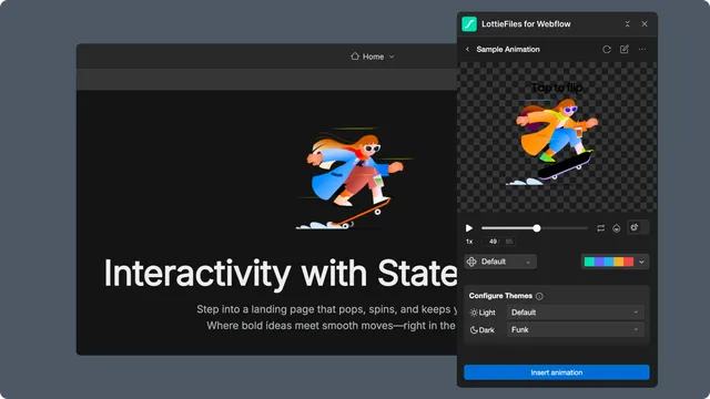
Themes let one dotLottie file expose named visual variants without exporting separate animation sources. Theme controls appear only when the selected file contains compatible theme data.
Preview a theme
Open an animation that contains themes.
Switch from Default to a named theme.
Play the complete animation and inspect every changed color.
Know which behavior will publish
Native Webflow Lottie - the selected theme is applied to the JSON inserted at that moment. It becomes a fixed visual result rather than a runtime-switchable theme.
Advanced dotLottie player - the inserted web component can retain a theme ID and optional light and dark theme IDs. The page runtime can respond to the browser's light or dark color preference.
Use the advanced path only when runtime switching is required. A site-controlled theme toggle and the browser's prefers-color-scheme setting are not automatically the same condition.
Test every published state
Preview the chosen theme in the app, Webflow Preview, and the staging URL. For runtime light and dark themes, test both browser color preferences and confirm contrast at every breakpoint.
If the file has no useful themes, edit or create them in Lottie Creator and save the result back to Workspace.